-700x200-1920w.png)
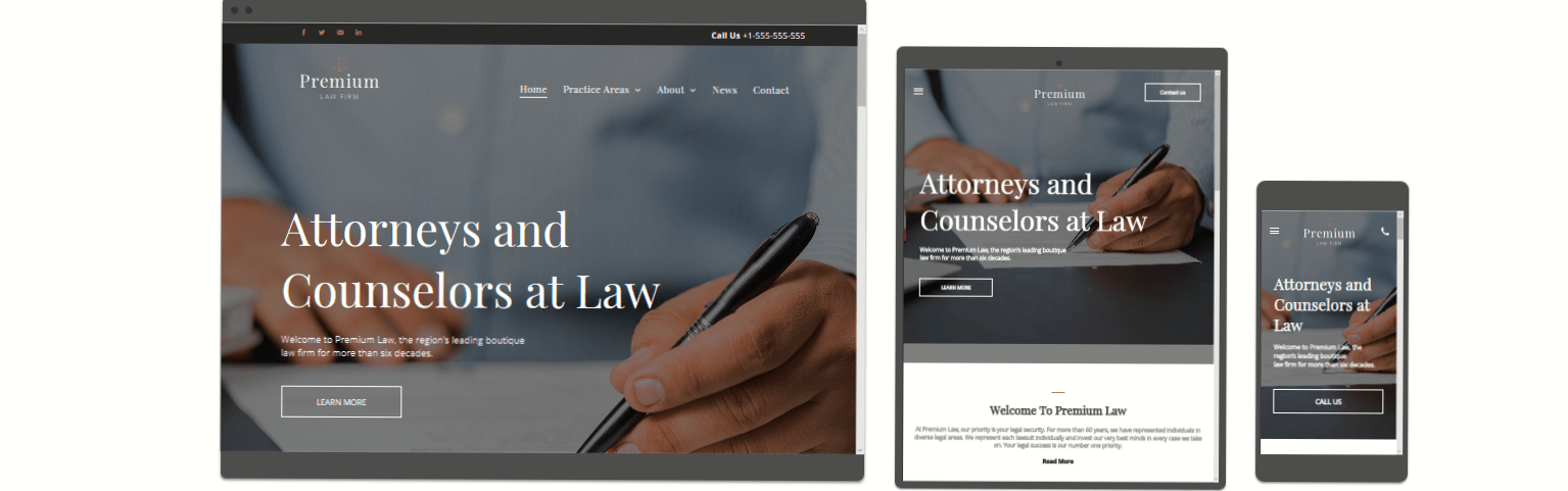
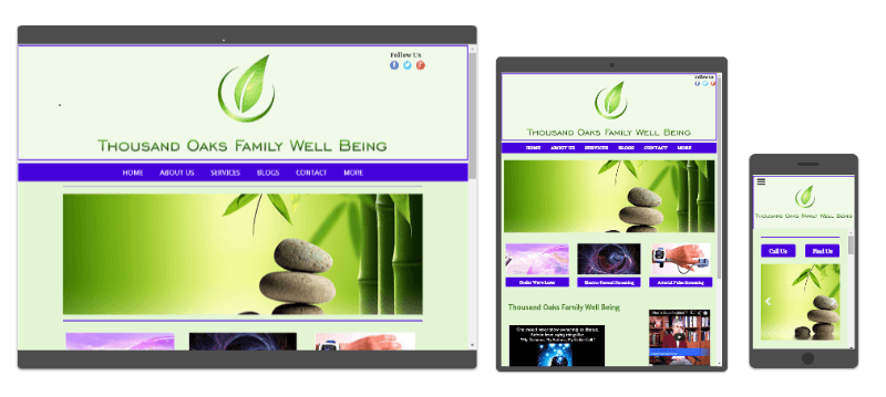
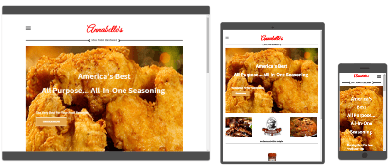
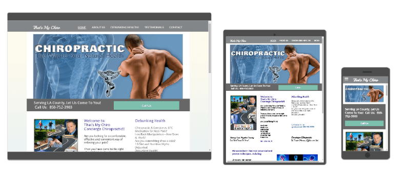
One Site Optimized For All Devices
Compliant With Google's "Best Practices"
We can take your existing website and convert it to be responsive. That way, your website will scale to the size of device it is viewed on. Whether your customers view your website on their desktop, their smartphone, or anything in between, your website (and ALL of your content) will look great and not require zooming.
Your website will look the same, but it will adapt quite differently. No matter what device your customers view your website on, their experience will be just as great, and they will have access to all of the content and functions of your desktop site.
"Your Brand On The Web 24/7 Across All Devices Vividly Displayed"
One URL!
For All Devices, No Redirecting! Fast Loading For User Experience!